

Build 10x products in minutes by chatting with AI - beyond just a prototype.
Next.js has emerged as a leading framework for building React applications focusing on performance and developer experience. Regarding styling these applications, CSS-in-JS libraries have become increasingly popular due to their ability to provide dynamic styling capabilities directly within JavaScript code. Emotion is one such library that stands out for its powerful and flexible approach to styling in Next.js applications.
Next.js is a React framework that enables functionality such as server-side rendering and generating static websites for React-based web applications. It's designed to make the development process smoother and optimize the applications' performance. With features like file-based routing, built-in CSS and Sass support, and pre-rendering, Next.js helps you create robust web applications.
When you create a Next.js application using create next app, you're setting up a project structure that includes an app directory and a pages directory, among other things. The app directory is where you can define your root layout and global styles, while the pages directory contains your page components that correspond to routes.
Emotion is a performant and flexible CSS-in-JS library that allows you to style applications quickly and with a great degree of customization. It supports both the styled components pattern and the css prop, making it a versatile choice for developers familiar with CSS-in-JS methodologies. Emotion is also compatible with client components in Next.js, although it may require specific configurations to work seamlessly.
With Emotion, you can define styles in a JavaScript file using the styled function, which can then be applied to your React components. This approach not only keeps your styles co-located with your components but also leverages the full power of JavaScript to create dynamic styles.
Combining Next.js with Emotion enhances the styling experience by allowing developers to write CSS styles alongside JavaScript logic. This integration is straightforward and brings the power of Emotion’s CSS-in-JS capabilities into the Next.js ecosystem, offering a seamless development workflow. Additionally, using a custom document component in Next.js helps render styles and insert them into the <head>.
To start using Emotion in your Next.js project, you need to install the necessary dependencies. This includes @emotion/react for the React-specific Emotion library and @emotion/styled for using the styled components pattern. You may also want to include @emotion/server for server-side rendering optimizations.
Here's how you can install these dependencies:
Once the dependencies are installed, you can begin to use Emotion in your Next.js project. For example, you can create a styled component using Emotion's styled function:
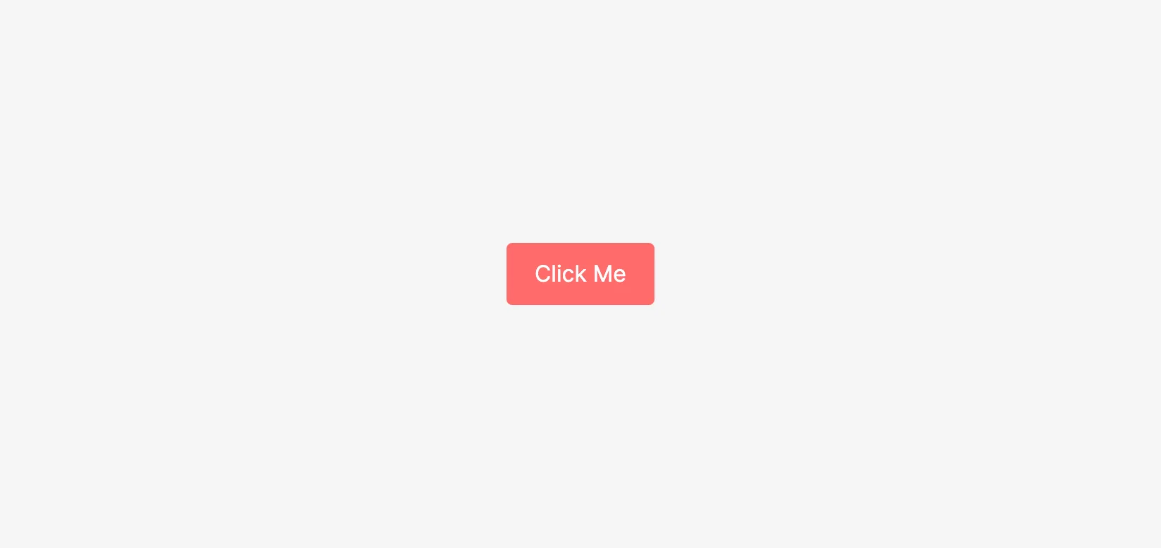
In Next.js, the App component plays a crucial role as it initializes pages. You can override the default App component to include global styles or to set up a custom Emotion cache. This is done by creating a _app.js file in the ‘pages’ directory.
Here's an example of how to customize the App component to use Emotion with a custom cache:
By wrapping your application with the CacheProvider from Emotion and passing in your custom cache, you ensure that all your styled components use this cache instance. This can be beneficial for performance optimizations and for avoiding conflicts with other instances of Emotion potentially used by third-party components.
Integrating Emotion with Next.js is a process that enhances the styling capabilities of your application. With these steps, you can set up Emotion in your Next.js project and start building beautifully styled components with ease.
Emotion shines when it comes to styling in Next.js, offering a CSS-in-JS solution that is both powerful and developer-friendly. By leveraging Emotion, you can write styles that are both dynamic and reusable, with all the benefits of JavaScript logic. Additionally, Emotion can insert critical css right before it's required, ensuring optimal performance and seamless integration with global styles.
Emotion 10 and above enhances server-side rendering by inserting style tags directly into the markup, which can sometimes interfere with certain selectors.
Styled components are a cornerstone of Emotion, allowing developers to encapsulate styles within reusable components. This pattern is particularly useful for creating a consistent design system across your Next.js application.
To use styled components with Emotion in Next.js, you first define your styled components using the styled function from @emotion/styled. Here's how you can define a NavBar component using Emotion's styled function:
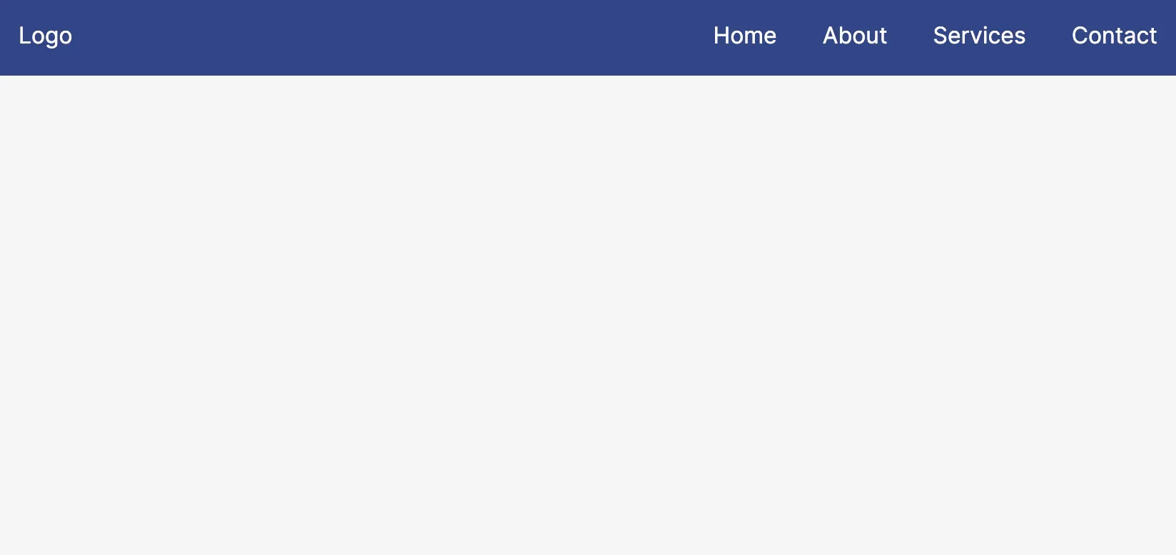
In this example, the NavBar and NavItem components are styled using Emotion's styled function, encapsulating all the necessary styles for the navigation bar and its items. The NavBar component sets the background color, layout, and spacing, while NavItem takes care of the individual navigation links' styling. These components can now be reused throughout the application, ensuring a consistent look and feel for the navigation experience.
React Server Components represent a new approach to building React applications, allowing you to render components on the server without sending the corresponding JavaScript to the client. This can significantly reduce the amount of code sent over the wire and improve performance.
Emotion works well with React Server Components, as it can generate the necessary CSS on the server and send only the styles that are required for the initial render. This is achieved through the use of Emotion's server-side rendering APIs, which extract critical CSS and enable it to be inlined in the HTML response.
Here's an example of how you might use Emotion with React Server Components in a Next.js application:
Custom _document.js:
Purpose: This file customizes the initial HTML document structure in a Next.js application.
Emotion Integration: It sets up Emotion for server-side rendering by creating a custom cache and extracting critical CSS.
Steps:
createCache and createEmotionServer are used to configure Emotion's server-side rendering.
The CacheProvider wraps the application to provide Emotion's cache.
The extractCritical function extracts the necessary CSS from the rendered HTML.
The critical CSS is inlined into the HTML response within a tag.
Example Component (ServerRenderedTitle):
Purpose: Demonstrates how to use Emotion's css function to style a React component.
Usage: The ServerRenderedTitle component is styled using Emotion and can be rendered on the server.
Key Point: Emotion ensures that only the critical CSS needed for the component is included in the server-rendered HTML, optimizing loading performance.
By following this approach, you can effectively use Emotion with React Server Components in a Next.js application, ensuring efficient server-side rendering and optimized CSS delivery.
When using Emotion with Next.js, it’s important to follow best practices to ensure that your application is not only visually appealing but also performs well. Emotion provides various mechanisms to optimize the CSS-in-JS experience, helping you maintain a high-performance application. Additionally, using gatsby-plugin-emotion is recommended for enabling emotion's SSR with Gatsby.
To optimize your use of CSS-in-JS with Emotion in a Next.js application, consider the following strategies:
As your Next.js application grows, it's crucial to keep scalability in mind. Here are some tips to ensure that your use of Emotion scales well with your application's complexity:
Componentization: Break down your UI into small, reusable components. This makes it easier to manage styles and improves the maintainability of your application.
Theme integration: Use Emotion's theming capabilities to maintain consistency across your application. A theme provider can help manage colors, fonts, and other design tokens.
Performance monitoring: Regularly monitor the performance of your application using tools like Lighthouse or Next.js's built-in analytics. This can help you identify bottlenecks related to CSS-in-JS and address them promptly.
Documentation and conventions: Establish coding conventions and document how to use Emotion in your project. This ensures that all developers on the team use Emotion consistently and efficiently.
Embracing Next.js Emotion unlocks a powerful and efficient way to handle styling in your React applications. By leveraging styled components and Emotion's CSS-in-JS capabilities, you can create dynamic, reusable, and maintainable styles that scale with your application's growth. With the added benefits of performance optimizations through critical CSS extraction and server-side rendering, Emotion stands out as an excellent choice for developers looking to combine the robust features of Next.js with the flexibility of CSS-in-JS.
<style>npm install @emotion/react @emotion/styled @emotion/serverimport styled from '@emotion/styled';
const StyledButton = styled.button`
background-color: #ff6b6b;
color: white;
font-size: 16px;
padding: 10px 20px;
border: none;
border-radius: 4px;
cursor: pointer;
&:hover {
background-color: #ff8787;
}
`;
function Home() {
return (
<div>
<StyledButton>Click Me</StyledButton>
</div>
);
}
export default Home;import { CacheProvider } from '@emotion/react';
import createCache from '@emotion/cache';
// Create a custom cache instance
const cache = createCache({ key: 'custom' });
function MyApp({ Component, pageProps }) {
return (
// Provide the custom cache to the app
<CacheProvider value={cache}>
<Component {...pageProps} />
</CacheProvider>
);
}
export default MyApp;import styled from '@emotion/styled';
const NavBar = styled.nav`
background-color: #348;
color: #fff;
padding: 1rem;
display: flex;
justify-content: space-between;
align-items: center;
`;
const NavItem = styled.a`
color: #fff;
text-decoration: none;
margin-left: 2rem;
&:first-of-type {
margin-left: 0;
}
&:hover {
color: #ddd;
}
`;
function Header() {
return (
<NavBar>
<div>Logo</div>
<div>
<NavItem href="#">Home</NavItem>
<NavItem href="#">About</NavItem>
<NavItem href="#">Services</NavItem>
<NavItem href="#">Contact</NavItem>
</div>
</NavBar>
);
}
export default Header;// pages/_document.js
import Document, { Html, Head, Main, NextScript } from 'next/document';
import { CacheProvider } from '@emotion/react';
import createEmotionServer from '@emotion/server/create-instance';
import createCache from '@emotion/cache';
const key = 'custom';
const cache = createCache({ key });
const { extractCritical } = createEmotionServer(cache);
export default class MyDocument extends Document {
static async getInitialProps(ctx) {
const originalRenderPage = ctx.renderPage;
ctx.renderPage = () =>
originalRenderPage({
enhanceApp: (App) => (props) => (
<CacheProvider value={cache}>
<App {...props} />
</CacheProvider>
),
});
const initialProps = await Document.getInitialProps(ctx);
const styles = extractCritical(initialProps.html);
return {
...initialProps,
styles: (
<>
{initialProps.styles}
<style
data-emotion={`${key} ${styles.ids.join(' ')}`}
dangerouslySetInnerHTML={{ __html: styles.css }}
/>
</>
),
};
}
render() {
return (
<Html>
<Head />
<body>
<Main />
<NextScript />
</body>
</Html>
);
}
}// components/ServerRenderedTitle.js
import { css } from '@emotion/react';
const titleStyle = css`
color: #333;
font-size: 24px;
`;
function ServerRenderedTitle() {
return <h1 css={titleStyle}>Welcome to Next.js with Emotion</h1>;
}
export default ServerRenderedTitle;/** @jsxImportSource @emotion/react */
import { css } from '@emotion/react';
function DynamicStyledComponent({ isActive }) {
return (
<div
css={css`
color: ${isActive ? 'green' : 'red'};
transition: color 0.3s;
`}
>
This text changes color based on the isActive prop.
</div>
);
}// Example of extracting critical CSS with Emotion
import { extractCritical } from '@emotion/server';
const { css, ids } = extractCritical(renderToString(<MyApp />));import createCache from '@emotion/cache';
const cache = createCache({ key: 'custom' });import styled from '@emotion/styled';
const StaticStyledButton = styled.button`
background-color: #0070f3;
/* ... other static styles ... */
`;import dynamic from 'next/dynamic';
const LazyLoadedComponent = dynamic(() => import('./LazyLoadedComponent'), {
ssr: false,
});import { ThemeProvider } from '@emotion/react';
const theme = {
colors: {
primary: '#0070f3',
// ... other colors ...
},
// ... other theme properties ...
};
function App({ Component, pageProps }) {
return (
<ThemeProvider theme={theme}>
<Component {...pageProps} />
</ThemeProvider>
);
}